How to create effective in-line messages with EesySoft? Here are our 5 best tips to create strategic & persuasive EesyMessages that drive action.
TL;DR
To get us started and sum things up in an easy way, the top five things to think about when creating EesyMessages are:
- Write content in a way that makes the target audience do something. Make it actionable, driving them to your desired behavior. Think critically about title and content to ensure it will be perceived accurately by the user
- Provide targetted users baby steps. Focus on Level 1 Thinking
- Call to action. (Give users a clear visual cue about where to tap/click)
- Messages should be short (Twitter, character limit)
- Timing is critical (When in the academic calendar of our target audience?)
Why message design matters?
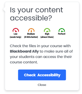
EesySoft provides many powerful ways to increase and improve adoption of Ed Tech tools for hundreds of customers. Using Campaigns, institutions can see the changes over time of the interventions they do, be they face to face training, or use of EesySoft capabilities such as the EesyMessage about the benefits of using grading rubrics marked in the example below.

EesyMessages can easily (pardon the phrasing) be used to target specific groups of people at specific times within the application of the Ed Tech tool itself. For example, it’s easy to put messages around the rubric tool to inspire and guide users not currently using rubrics in say a specific department. EesyMessages are used for a lot of things beyond inspiring like - creating awareness for students about paying tuition bills, informing faculty about new features or even deflecting support requests.
At EesySoft, we want to continually improve the effectiveness of messages we create and provide to our customers as well as help our customers create the most effective messages possible. One of the things we’ve done on that continual improvement front is apply Persuasive Design [2] tactics across EesySoft. This approach helps many parts of EesySoft but here we’re going to focus on improving the effectiveness of EesyMessages.
Top 5 Things to Think About To Improve Effectiveness of EesyMessaging:
1. Make messages actionable.
Write content in a way that makes the target audience do something. Whether a message is intended to deflect support, inspire use of an Ed Tech tool, or remind students to pay a bill, each of these examples has a target audience which is supposed to do or not do something e.g. all users avoid a common problem, increase faculty use of an ed tech tool, or students who haven’t paid their bill. Start by thinking about the target audience and the actions that you want them to do. To do this most effectively, you need to know something about the target audience.
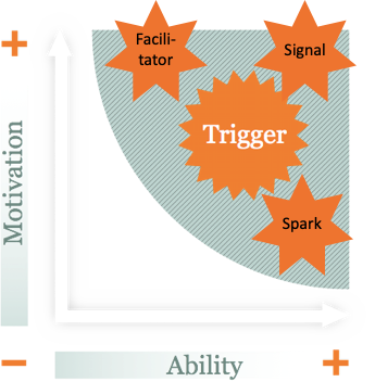
Three factors to consider about your audience are described by the Fogg Behavioral Model (FBM), motivation, ability, and a trigger, which we will describe further below.
BJ Fogg, a Stanford professor, provides this behavioral model and overall approach to motivate changes in behavior embraced across consumer and business technology and underpinning persuasive design. The FBM describes that in order to change behavior, an individual needs to have motivation, ability, and a trigger at the same moment. The FBM further clarifies long term change is based on cumulative changes over time [3].

To illustrate this, let’s go further down the rubric example. At a basic level there are two populations of users, those which use rubrics to grade, and those which don’t. The users that don’t use rubrics certainly have a variety of reasons why they don’t use them -- maybe they think the tool takes too much time to use or is too complicated, maybe they don’t know the tool exists, maybe they don’t feel their pedagogic approach benefits from using a rubric tool, maybe they really want to but just don’t have the time to even look at the tool, and so on. What inspires someone who wants to use the rubric tool but feels like they don’t have time is different from someone who doesn’t have an assessment approach where they think rubrics are useful.
So start by thinking about your user, the actions you’re trying to influence, and write content focused on the right triggers for your users. If someone has high motivation but finds something hard to do (maybe they don’t have enough time) then your content should provide a facilitator trigger focused on reducing the effort it takes to do a thing. For example, maybe the highly motivated user with no time to get into the rubric tool was not aware that there are already several examples of rubrics being effectively used at departmental and individual levels which can easily be imported, customized, and used in their own courses.
When your target users have a high ability to do something but low motivation, your content should focus as a spark trigger providing arguments on why a thing should be done. Spark trigger content examples include anticipation, for example, if you don’t pay your bill on time, something bad could happen. Spark triggers also can align towards social cohesion -- for example, students really want you to use this rubric tool because they’ve been exposed to it in another course and saw benefit.
Most institutions do not like taking too harsh a tone nor do we at EesySoft so we look at the example of inspiring students to pay their bills as the third type of trigger your content can be -- a signal trigger. Instead of threatening students with something bad happening if they don’t pay their bill, we expect that most students will have high motivation and an ability to pay their tuition bill. For a signal trigger then to inspire those which may have not paid, the content should feel personalized and timed appropriately -- if not, it could feel like spam[4].
2. Give users baby steps.
One of the most common things we hear from faculty is that they don’t have enough time to do more. In order to message effectively to people who don’t feel like they have enough time, content should be broken into steps. A good way to think about how to provide baby steps is to consider whether the content in your messages requires level one or level two thinking from your users. Howard Marks describes, “First-level thinking is simplistic and superficial, and just about everyone can do it...Second-level thinking is deep, complex and convoluted.”[5] Why this is important to baby steps is how effort and complexity affect our feelings about whether we have time for something. For example take the problems 2+2=? compared with 17x36=?. Every one of our users will know 2+2=4 without any mental effort. Every one of our users will also be able to calculate 17x36=612 but that will take most of them some mental effort to do it in their head, or the effort to pull up a calculator and obtain the result. Someone who perceives they have little time is less likely to do something which requires extra mental or physical effort.

Breaking messages into baby steps means that the content of each message should be more like asking the mental effort of 2+2 instead of 17x36. Going back to the example of the rubric tool, we want to make using the tool, the simplest process possible. In order to be simple, we cannot do this effectively with one long message describing all the benefits, how-to, processes, examples, and resources available for using the rubric tool. We must use simple messages to guide our users through each step of using the tool.
3. Use a call to action
This one is easy! If you want users to do something, make it as easy as possible by highlighting actions visually. For example, this message with a button makes it much easier for people to take action than the small text link in the second example message.
Clear call-to-action

Too many actions, none clickable

4. Messages should be short.
From tips 1 through 3, we now know messages should be focused on actions, actions should be broken into baby steps, and those actions should have a visually easy way for users to take action. Keeping messages short is a great way to make sure you achieve all those goals. Think about keeping individual messages to Twitter-like lengths to help keep your content to baby steps requiring level one thinking.
5. Timing is critical.
If you know your users and you know the actions you want to enable, you will also know the right times to message them. This is important for obvious reasons, for example messaging students about paying their tuition bill at the wrong time of the academic calendar will not be effective in increasing the on-time payment rate and reducing student difficulties. Furthermore if timed wrong, it will feel like spam and make students less likely to pay attention to messages in the future. Timing also matters when faculty buried in administrative processes may be less open to even the most actionable and well written messaging campaigns.
We hope you find these tips helpful in your messaging. Please share your stories about how you’ve used messaging at your institution and look forward to our future posts on how Persuasive Design is helping EesySoft become even more effective at making your Ed Tech adoption easier!
Citations
[2] Ibid
[3] Ibid
[4] Spamming. (2001, October 1). Retrieved from https://en.wikipedia.org/wiki/Spamming
Thanks Freepik

